Being the main element of corporate style of any company, logotype must form an unambiguous perception of the company; must differ the company from all others; must be attractive and contain an idea. But above all, the logo must be readable.
After reviewing different logos from all over the world, we started to notice that nowadays approximately every 10th logo was developed using the principle of replacing a letter in the naming with a symbol. Using this method, the designer randomly chooses a letter in the naming and replaces it with a symbol that would emphasize the category the company's product belongs to.
It is common for a client to request the agency to create a unique logotype that would differentiate them from others. In this case, many designer apply the method of replacing a letter with a symbol in order to create a "unique" and "unusual" idea for the logo that would be different from others.
We observe different examples of designers presenting this replacing method as the main idea in the development of logo and its individuality. However, in most cases the logo becomes unreadable.
We point our 4 types of this method:
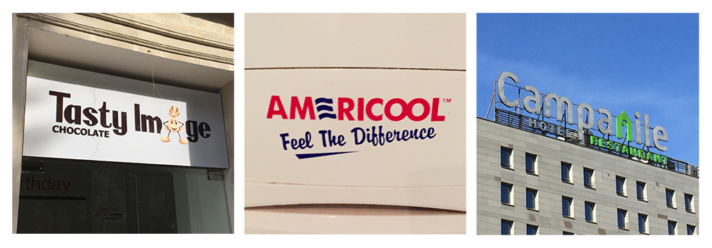
1. In the first case first letter in the logo is replaced with the symbol. Evidently, many users are used to the fact that the corporate symbol of the company is usually placed next to the naming (before or after). In this case, the application of this method causes confusion and people start to read the logo from the second letter.

2. In the second case designers replace the last letter, which is simply ignored by the users because they are used to the symbols and signs after the naming and do not perceive it as being a letter or part of the naming.

3. In the third case, designers replace a letter in the middle of the word. In this case, the readability is higher, however this form is still not sufficient for instant perception by all users and customers.
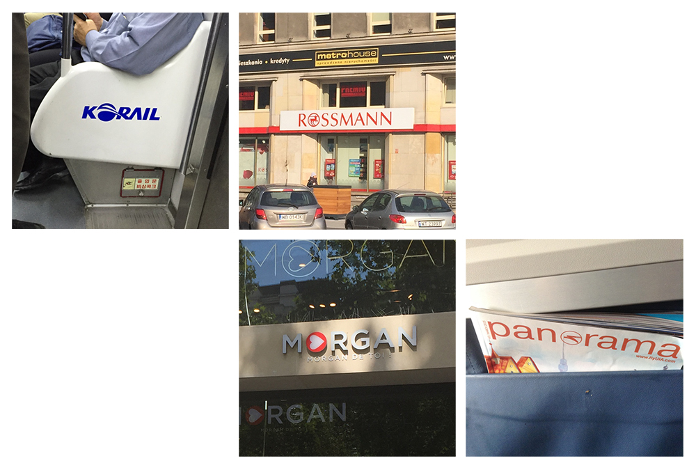
4. The readability is least violated when the designers replace the letter O in the naming with the symbol. The reason for it is that the designer doesn't change the shape of the letter when using the replacement method.
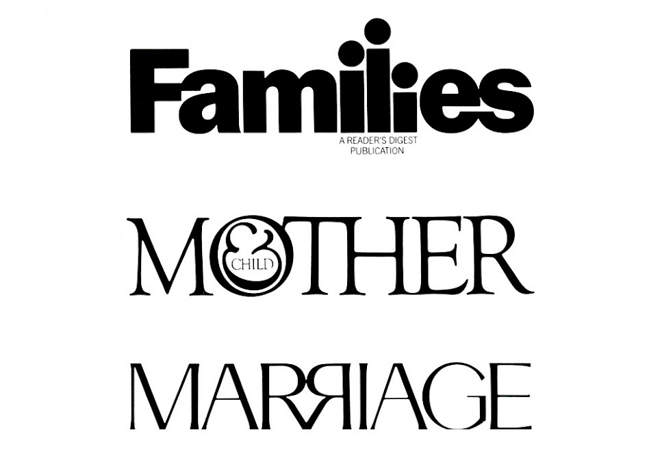
Most experiments associated with the method of replacing a letter with a symbol aren't successful. However, the works of Herbert Lubalin can present a good example of successful use of this method. His solution for applying this principle was that he added the symbols to the logo, but didn't change the fonts in the naming. This way, he didn't violate the readability of the logo.